
Reporting is the process of organizing and presenting data in a structured format to communicate key insights, trends, and performance metrics. It helps businesses and organizations make informed decisions by transforming raw data into understandable and actionable information. Reports can take many forms, from simple tables and charts to interactive dashboards, and are essential for monitoring performance, identifying opportunities, and addressing challenges. Effective reporting ensures that stakeholders have the right data at the right time to support strategic decision-making.
Power BI offers seamless integration with a wide variety of data sources.
For more information regarding to connection to data in Power BI Desktop click here
Raw data almost never comes in the perfect form for analysis, so the data transformation step is crucial. Here’s where Power Query Editor comes in, allowing users to:
Power Query has a rich set of features to handle even complex data preparation workflows.

Visualizations help users interpret data more easily and quickly by representing numbers in a graphical format. Power BI offers a rich set of visualization options, including charts, tables, maps, and KPIs.
Charts:
Tables and Matrix:
Maps:
Power BI provides various types of maps (e.g., choropleth maps, bubble maps) to visualize geographical data. These are useful when the data has location-based information.
Custom visuals will be disabled at the tenant level, restricting their use across all users and environments within the organization.

Power BI excels at providing interactivity for users to engage with reports and dashboards:
Filters & Slicers:
Users can apply filters on visuals using slicers to segment data. These filters are often interactive and can be linked across all visuals in a report (e.g., filtering by region filters all charts in the report).
Drill-Down:
Power BI enables drill-down functionality where users can click on a data point (e.g., a bar in a bar chart) to explore more granular data.
Cross-Filtering:
When selecting an item in one visual (e.g., a bar in a chart), it can filter the other visuals on the report. This feature enhances interactivity and provides users with multiple ways to explore the data.
Dynamic Titles and Measures:
Titles and measures can change dynamically based on user interactions, making the report even more personalized and context-aware.
Bookmarks:
Bookmarks are snapshots of a report’s state. They allow users to create custom views that can be easily navigated back to or used for storytelling within the report.
Once your report is ready, it’s time to publish it to the Power BI Service. This is a cloud-based platform that allows you to share reports and collaborate.
Publishing Reports:
You can publish reports to the Power BI service directly from the Power BI Desktop application. These reports are hosted in the cloud, where users can access them via a web browser or mobile app.
Sharing:
Reports and dashboards can be shared with others through links, direct access, or email subscriptions. The Power BI Service allows users to create dashboards by pinning visuals from different reports.
Row-Level Security (RLS):
This feature ensures that users only see the data they are authorized to view. By applying roles to users, you can restrict access to data based on the user’s role within the organization.
Power BI users can publish to their own workspace or to workspaces where they are at least a Contributor.

A theme is a standardized set of colors and formatting options that can be applied to your entire Power BI report, including visuals, text, and shapes, in just a few clicks.
The purpose of a theme is to allow you to retain a consistent design across your report, without having to change each element individually.
Using Power BI themes allows you to quickly apply design changes to your entire report so that you can build and design reports with a consistent look and feel.
The beauty in applying a theme to your report is that all the visuals will reflect the formatting and colors, as default, from your selected theme.
Applying a theme to your reports can save you hours, as you won't have to manually change the formatting of each element, your theme takes care of that.
To start using themes in Power BI, navigate to the View ribbon and select the drop-down arrow in the themes section.

Published report in a shared Workspace, meaning a workspace to host data products for a team (Gold Worskpace)
Reports can be published to workspaces where multiple users can collaborate. Depending on the permissions set in the workspace, citizen developers can view, edit, or interact with the report.
Develop in a workspace and share through an app in Power BI. |


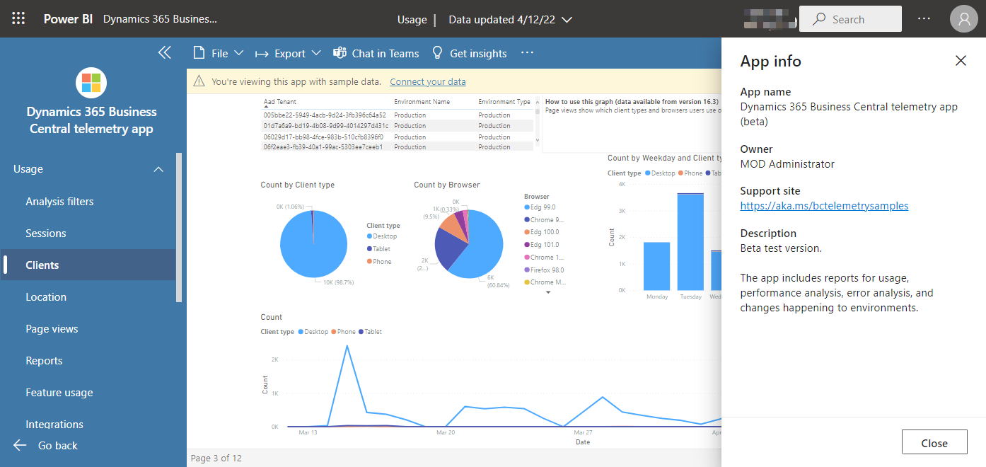
A Power BI app is a packaged set of content, such as dashboards, reports, created by Power BI designers and shared with a broader audience. Apps are developed in workspaces, where team members collaborate and then publish the app to specific users, groups, or the entire organization. Permissions for an app can differ from the workspace, simplifying permission management. Apps bundle related content in one place, making it easier to distribute and access. Designers can share apps in various ways, including through platforms like AppSource
Apps are an easy way for designers to share many types of content at the same time, and managed different Audiences
In Power BI, you can either be a designer who creates and shares apps or a business user who receives and uses apps created by others. To view or open an app, users need a Power BI Premium Per User (PPU) license.
Step1: Setup

Step 2: Add content


Step 3: Create and manage audience groups using the Audience tab

Step 4: Share the App with the App consumers


Market Place for Organizational Apps

Usage metrics help you understand the impact of your dashboards and reports. When you run either dashboard usage metrics or report usage metrics, you discover how those dashboards and reports are being used throughout your organization, who's using them, and for what purpose. This article outlines usage metrics reports.
Usage metrics reports are read-only. However, you can copy a usage metrics report. Copying creates a standard Power BI report that you can edit. You can also build your own reports in Power BI Desktop based on the underlying semantic model, which contains usage metrics for all dashboards or all reports in a workspace.

Start in the workspace that contains the dashboard or report.
From the workspace content list, select More options (...) for the report and select View usage metrics report.
